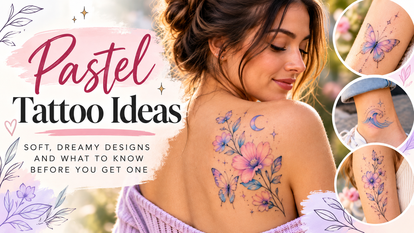
Pastel Tattoo Ideas: 15 Soft, Dreamy Designs and What to Know Before You Get One
A washed-out sunset, a cotton candy sky, a faded bouquet pressed between book pages. If that’s the vibe you want on your skin, you’re probably thinking about a pastel tattoo.
These soft-hued designs have surged in popularity because they feel gentle instead of loud. Instead of saturated black outlines and bold color packing, pastel work uses muted pinks, powdery blues, and milky lavenders that look almost airbrushed.
There’s a catch, though. Pastel ink behaves differently than traditional color, and how it heals, fades, and shows up on your skin tone matters a lot before you commit.
In this post, we’ll cover what pastel tattoos actually are, 15 dreamy design ideas, how the ink works on different skin tones, what healing and fading really look like, what you’ll pay, and how to pick an artist who can pull it off. Let’s start with the basics.
What Makes a Pastel Tattoo Different From a Regular Tattoo
A pastel tattoo is a tattoo built from low-saturation pigment. Instead of packing saturated color straight from the bottle, the artist mixes muted pigments with a white or diluting base, which creates milky shades like baby pink, powder blue, lavender, mint, peach, and butter yellow. The result reads like watercolor on paper rather than marker on glass. Think of the difference between a neon sign and a sunrise; both show color, but one whispers while the other shouts.
The look goes beyond color alone. Pastel pieces usually lean on fine linework, soft edges, and generous negative space, so the skin itself becomes part of the design. That emptiness is what keeps the muted shades from turning muddy.
Why Pastel Ink Looks Softer on the Skin
Your skin sits between the ink and the world. Every color you see on a tattoo is filtered through a layer of tissue, the way a watercolor painting looks different under frosted glass. Because pastel pigment is already diluted, that filter has less color to work with, and the result lands somewhere between the ink’s original tone and your natural skin tone.
On lighter skin, those diluted shades show up close to how they look in the bottle. On deeper skin tones, muted pinks and blues can shift warmer or disappear into the base tone, which is why a skilled artist will adjust the palette before ever picking up the machine. Diluted pigment also behaves differently during healing; some of it can fade out entirely as the skin repairs itself, giving the finished piece that faded, dreamy quality people chase in the first place.
Pastel vs. Traditional Bold Color Tattoos
The two styles serve different goals, so the right choice depends on what you want the piece to do.
| Factor | Pastel Tattoo | Bold Color Tattoo |
|---|---|---|
| Visual impact | Subtle, soft, close-up appeal | High contrast, visible from across a room |
| Aging | Can blur or fade unevenly sooner | Holds saturation longer |
| Maintenance | May need touch-ups earlier | Touch-ups usually further out |
| Best fit | Delicate, feminine, minimalist designs | Statement pieces and cover-ups |
Pastel work trades longevity for atmosphere. Since the pigment sits lighter in the skin, sun exposure and natural cell turnover tend to fade it faster than fully saturated color. If you’re deciding between the two, consider placement honestly: a pastel design on a hand or forearm will see far more sun than something on your thigh. If a bold, saturated look is more your speed, browsing traditional tattoo styles for men can show you how saturated ink and heavier linework age over time. Either way, you’re choosing a tradeoff, not a strictly better option.
Dreamy Pastel Tattoo Ideas to Inspire Your Next Piece
Now for the fun part: the designs themselves. Pastel ink shines brightest on pieces that lean delicate, whimsical, or painterly, because muted pigment rewards soft edges and negative space. The five categories below cover the most popular directions, each with placement notes and a reason it works so well in low-saturation color.
Soft Botanical Designs: Wildflowers, Lavender Sprigs, and Mushrooms
Florals are the backbone of pastel tattooing, and for good reason. A bouquet of faded cornflowers, poppies, and baby’s breath in dusty rose and butter yellow looks like a pressed-flower page come to life. Because petals have natural gradients, the diluted pigment mimics that soft bleed without any extra technique.
Lavender sprigs work beautifully as small, single motifs. A thin stem with milky purple buds sits nicely on the inner forearm, the side of the ribcage, or running along the ankle bone. For something more layered, a wildflower bouquet wrapping the collarbone keeps the softness while adding movement.
Cottagecore fans have pushed mushrooms into the spotlight. Think fly agaric caps in blush pink with mint stems, or clusters of tiny toadstools dotted with pale yellow spots. Forearms and calves give these pieces room to breathe, while a single mushroom behind the arm reads charming and understated.
Celestial and Cloud Imagery: Moons, Stars, and Cotton Candy Skies
Few subjects suit pastel ink like the sky itself. A gradient sunset piece, peach melting into lavender melting into powder blue, turns your skin into a permanent dusk. Artists often build these with soft washes instead of hard lines, so the color looks airbrushed on.
Tiny star clusters in pale blue or lilac make excellent minimalist work, especially scattered across the shoulder or collarbone. Crescent moons in peach or cream add warmth without saturation, and fluffy cloud outlines in soft gray-blue keep everything airy. These designs read as dreamy precisely because they avoid bold blackwork; the composition does the talking while the color stays quiet.
Cute Character and Kawaii Pastel Tattoos
If your style leans playful, kawaii designs and pastel ink were made for each other. Anime-inspired pieces with milky pink hair or mint clothing keep the sweetness without harsh outlines. Tiny animals are the crowd favorite: frogs in sage green, bunnies in cream, kittens in dove gray with blush cheeks.
Sweets translate wonderfully too. A cupcake with cotton candy frosting or a stack of macarons in pastel palette colors fits easily in an inch of space. Add cartoon hearts in candy shades if you want something even smaller. The wrist, behind the ear, and the inner arm are the go-to spots, since these pieces thrive at a scale where bold color would just turn muddy.
Watercolor Blends and Abstract Pastel Shapes
Watercolor style tattoos drop hard outlines entirely. Instead, the artist layers soft bleeds of pigment, letting colors drift into one another like wet paint on paper. Abstract blobs, gradient washes, and splashy shapes in peach, lilac, and mint create pieces that feel more like paintings than drawings.
One honest warning: this style fades faster than any other pastel approach. With no dark outline to anchor it, the pigment diffuses under the skin over time, and edges can blur within a few years. A skilled artist matters enormously here; someone who understands pigment dilution and skin depth will build the piece to age gracefully rather than wash out.
Matching and Minimalist Pastel Pieces
Some of the best pastel tattoos are also the simplest. Friendship and couple tattoos in matching palettes, say, two tiny planets in the same peach-and-blue scheme, let the shared color tell the story. Because pastel shades are distinctive but subtle, the connection is there for those who notice.
Single-color symbols work the same way. A lilac paper plane, a soft pink lightning bolt, a tiny mint star: one shape, one shade, done. Fine-line script in pale pink or lavender adds a personal touch, whether it’s a date, a word, or a short phrase. These pieces sit well on the wrist, the inner arm, or the collarbone, and they’re a low-commitment entry point if this is your first tattoo in muted color.
How Pastel Tattoos Heal, Fade, and Age Over Time
Pastel tattoos are beautiful, but they play by different rules than bold, saturated ink. The same dilution that gives them that dreamy, watercolor look also makes them more sensitive to healing mistakes, sun exposure, and time. Knowing exactly what to expect week by week, plus how these pieces age over years rather than months, helps you decide whether the tradeoff is worth it for you.
The Healing Process: What to Expect Week by Week
Most pastel tattoos heal on the standard two to four week timeline, and the experience looks similar to any color tattoo. Weeks one and two bring the familiar stages: redness and tenderness first, then flaking and light peeling as the skin repairs itself. The trick with pastels is resisting the urge to pick, because pulling flakes early can lift pigment entirely, and light inks have less margin to lose.
Basic aftercare matters even more here. Your artist will wrap the piece; keep the first bandage on as long as they recommend, then wash gently with fragrance-free soap and apply a thin layer of unscented moisturizer a few times daily. Avoid soaking, direct sun, and tight clothing over the area while it heals.
Here’s the encouraging part: many pastel tattoos actually look softer and more cohesive after healing. Once the initial redness and plasma swelling subside, the pigment settles into the skin and that milky, faded quality people want often comes through. Days four through ten can look patchy or dull while peeling; that’s normal, so don’t panic or book a touch-up yet. Wait a full month before judging the final result.
Do Pastel Tattoos Fade Faster? The Honest Answer
Yes, and it’s worth understanding why. Light pigments sit closer to your skin tone by design, so there’s less pigment density under the surface to begin with. As your body naturally sheds and regenerates skin cells over the years, a pastel shade has less “reserve” to draw from. Faded pink simply blends into your base tone, whereas faded black still reads as gray.
Sun exposure is the single biggest accelerant. UV light breaks down pigment particles, and pale yellows, peaches, and mints are the first to go. A pastel piece on your calf that sees regular sun without SPF can noticeably soften within a couple of years, while the same design on an inner thigh might stay crisp far longer.
Plan on touch-ups every few years if you want to keep the piece looking fresh. Many artists offer discounted or free touch-ups within the first year, so ask about their policy when booking. Think of maintenance the way you’d think about balayage: the initial appointment creates the look, and occasional refreshes keep it there. That recurring cost and commitment is part of the deal with pastel work, and most people who love the style consider it a fair one.
How to Choose the Right Artist for a Soft Pastel Tattoo
Here’s a truth that surprises a lot of first-timers: not every tattoo artist can pull off pastel work. Diluted pigment is unforgiving. There’s no bold black outline to hide a shaky line or uneven color pack, so mistakes show immediately and only get more visible as the piece ages. You need someone who works with light pigments regularly, understands how they settle into skin, and knows how to adjust shades for your specific skin tone. Picking the wrong artist is the difference between a dreamy piece and a patchy disappointment, so treat this search like hiring, not shopping.
Portfolio Red Flags and Green Flags
Scroll past the polished Instagram grid and dig into the actual portfolio. The biggest green flag is healed photos, meaning pictures taken months or years after the tattoo finished healing. Fresh shots flatter everything; healed shots tell you what the artist’s work actually becomes. Look for consistent soft color blending, clean and confident linework, and pastel pieces that still hold their shape over time.
Red flags are just as telling. A portfolio made up entirely of fresh photos suggests the artist either doesn’t track healed work or doesn’t want you seeing it. Muddy or patchy color, blurry edges, and blown-out whites all point to someone still learning how diluted pigment behaves. And if there’s no pastel or watercolor work in the portfolio at all, that’s your answer: they may be a great black-and-grey artist, but this style isn’t their lane.
Questions to Ask Before You Book
Before dropping a deposit, have a real conversation. Any artist worth booking will answer these comfortably:
- How much pastel work do you do, and can I see healed examples? If they hesitate, keep looking.
- How will these shades show up on my skin tone? A good artist adjusts the palette rather than pretending every ink looks identical on everyone.
- What’s your touch-up policy? Pastel pieces often need a refresh sooner than bold work, so you want the terms upfront.
- Where would you place this design, and why? Placement affects both fading and how the color reads, and their reasoning reveals their experience level.
- How is pricing structured? Some charge hourly, some flat rate, and touch-ups may or may not be included.
Pay attention to how they respond as much as what they say. Pastel tattoos demand a collaborative, detail-oriented artist, so someone who brushes off your questions or rushes the consult probably rushes the tattoo too. Trust that instinct and book the artist who talks you through everything, not past it.
Cost, Placement, and Care Tips for Your Pastel Tattoo Idea
Budget, placement, and aftercare decide how happy you’ll be with a pastel tattoo a year from now. Get these three right and the piece stays soft and dreamy; get them wrong and even great artwork can wash out early. Here’s what to expect before you book.
What Pastel Tattoos Typically Cost
Most shops price small pieces at a flat minimum, and pastel work usually falls in that entry tier. A tiny single-shade symbol or small script piece often runs $100 to $300, while medium florals or celestial clusters land somewhere between that and a full hourly session. Larger watercolor-style work takes longer because blending soft gradients requires patience, and skilled artists charge for it, often $150 to $250 per hour depending on your city.
A few things push the price up. A fair-skinned palette needs less adjustment than color work tuned for deeper skin, complex blending takes real time, and highly sought-after artists book at premium rates. Also ask whether your touch-up is included; given how fast light ink can soften, a shop policy on free first-year refreshes has real dollar value.
Best Placements for Visibility and Longevity
Placement is a longevity decision as much as a style one. Areas that see less sun keep pastel pigment crisp far longer, while high-friction, high-exposure spots fade fastest.
- Inner upper arm, thigh, and ribcage are the longevity winners. They stay covered, see minimal UV, and give soft gradients room to breathe.
- Forearm, shoulder, and calf work well if you want visibility, but commit to daily sunscreen over the piece.
- Hands, fingers, and feet fade quickly in any style, and diluted pigment has little reserve, so expect frequent touch-ups if you go there.
If you’re torn, start with a covered spot for your first pastel piece and see how the color settles before putting it somewhere exposed.
Aftercare That Protects Light Inks
Healing rules look familiar, but pastels punish shortcuts more than bold work does. Wash gently with fragrance-free soap, pat dry, and apply a thin layer of fragrance-free moisturizer two to three times daily. Skip pools, baths, lakes, and saunas entirely during the two to four week healing window; soaking softens scabs and can lift pigment you can’t afford to lose.
Then comes the rule that matters most: sunscreen is the single biggest factor in keeping pastel colors from washing out. UV breaks down pale pigments first, so once the tattoo is fully healed, treat it like skin you’re protecting for life. Use SPF 30 or higher on the piece whenever it’s exposed, even on cloudy days, and reapply after swimming or heavy sweating. Loose clothing over the area adds a second layer of defense.
Covered or not, expect to refresh the piece every few years to keep those milky pinks and lavenders reading clearly. Book your artist’s touch-up policy into the plan upfront, and the dreamy look you fell for will stick around far longer.
Conclusion
A pastel tattoo gives you something bold ink usually can’t: a piece that feels personal and quiet instead of loud. Whether you’re drawn to soft florals, cotton candy skies, or a tiny mint star, the style rewards artists who understand diluted pigment and owners who commit to sun care. Expect fading, plan on touch-ups, and protect the piece with SPF so those milky shades keep their dreamy quality.
If a design has been sitting in your head, save it before you lose it. Start a Pinterest board with the pieces you love most, then take that collection to a consult with an artist who has healed pastel work in their portfolio. A real conversation about your skin tone, placement, and budget is the best first step toward ink you’ll still adore years from now.
Save pin for later


- How to Design Your Own Tattoo Without Regret: A Step-by-Step Guide - September 23, 2026
- 20 Daisy Tattoo Design Ideas With Meanings, Placements, and Style Tips - September 23, 2026
- 20 First Tattoo Ideas for Women: Beginner-Friendly Designs You’ll Still Love in 10 Years - September 23, 2026
Leave a Reply