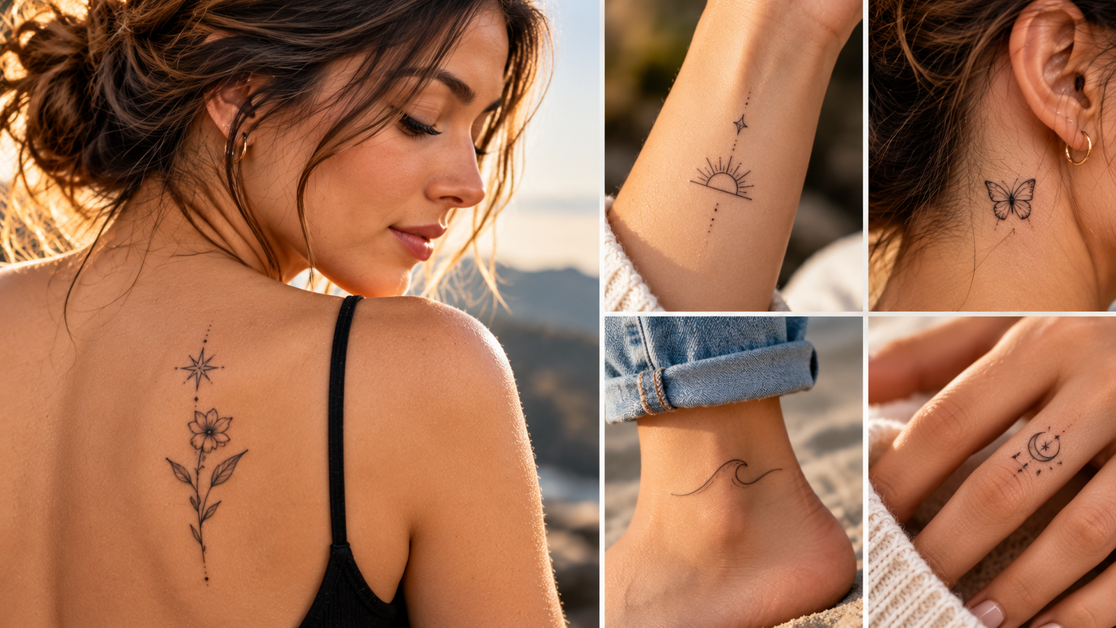
21 Subtle Minimalist Tattoo Ideas That Age Gracefully
The best tattoos are often the ones nobody notices at first glance. A tiny line, a single symbol, a whisper of ink on the wrist. These small pieces work because they ask little of you: minimal commitment, minimal cost, and easy to hide under a shirt sleeve when the occasion calls for it.
But small tattoos come with a catch. Fine lines and delicate designs are the first to blur as your skin changes over the years, so choosing a design that holds its shape matters more than the size of the piece itself.
That’s where subtle minimalist tattoo ideas shine. Below you’ll find 21 designs that stay sharp for decades, plus practical advice on picking artwork that ages well and choosing placements that keep your ink looking fresh in 10 or 20 years.
Why Some Minimalist Tattoos Age Gracefully (and Others Don’t)
Every tattoo changes. Your skin stretches, sheds, and renews itself for decades after the needle stops, and the ink sits along for the ride. Some designs ride those changes well and still look sharp at year fifteen. Others fade into a faint gray smudge by year three. The difference usually comes down to three things: how thick the lines are, where the tattoo sits on your body, and how much detail the design carries.
Dermatologists explain that tattoo ink lives in the dermis, the layer of skin beneath the surface, and skin naturally changes with age in ways that shift and soften everything beneath it. Knowing that upfront helps you choose a design built for the long haul.
The Rules of Line Weight, Ink Depth, and Design
Thin lines look stunning on day one. Give them five years and many start to lose their edge. Here’s why: ink particles slowly spread through the dermis over time, a process tattooers call ink spread. When a line is hair-thin to begin with, even a tiny amount of spread makes it look soft or blurry. A slightly thicker line has room to spread and still reads as a clean line.
This is why single-needle work fades fastest. Single-needle designs deposit the least ink, at the shallowest effective depth, in the finest lines possible. The result is gorgeous, delicate art that often needs a touch-up within a few years. Medium line weight, roughly the width of a fine pen nib, holds its shape far longer because there’s simply more ink packed into each stroke.
Design complexity matters too. Solid black shapes and simple symbols are forgiving. Grayscale shading, whisper-light gradients, and intricate micro details are not. As ink fades, subtle tones collapse into mush; what was a soft shadow becomes a gray blotch. A bold little crescent moon will outlast a photorealistic hummingbird the size of a quarter, every time.
The practical takeaway: choose linework thick enough to survive spread, skip anything with detail smaller than a pencil eraser, and lean toward timeless shapes over trendy motifs. Fine line script, for example, looks great fresh, but tiny lettering is one of the first things to become illegible. If you love text, size it up or keep it short.
A tattoo that relies on delicacy for its impact is the most likely to lose that impact first.
Best and Worst Spots on the Body for Longevity
Placement can matter as much as the design itself. Skin that moves constantly, rubs against clothing, or soaks up sun chews through fine lines quickly. Skin that stays protected and relatively stable keeps ink crisp for decades.
Some spots consistently age well. The inner arm sees little sun and little friction. The upper thigh stays covered most of the year and has stable, low-movement skin. The ribs hold ink nicely too, though they cost more in pain than in longevity. Shoulders and outer forearms also perform well for the same reason: thick, even skin with minimal stretching.
Then there are the trouble zones. Hands, fingers, and feet shed skin cells faster than anywhere else on the body, so tattoos there fade noticeably within months, not years. The neck and throat get constant sun and movement. Areas that bend a lot, like elbows, knees, and wrists where bands wrap, blur fastest because the skin creases thousands of times a day. A fine line tattoo on a high-movement spot is basically signing up for early touch-ups.
If your heart is set on a finger tattoo, go in with open eyes. Many artists now refuse to guarantee results on hands and fingers at all, and for good reason. Choose the fleshy, protected, low-sun areas and your minimalist piece will look nearly identical a decade from now.
21 Subtle Minimalist Tattoo Ideas That Age Gracefully
Here’s the full list, grouped into three themes so you can find your style fast. Each idea is small, simple, and chosen with longevity in mind. As you browse, notice a pattern: the designs that last are the ones built on clean curves, solid shapes, and lines with enough weight to survive ink spread.
Nature-Inspired Designs: Waves, Mountains, and Botanicals
Nature translates beautifully into minimal ink because its shapes are already simple. Curves, peaks, and stems read clearly even after years of softening, since the eye fills in small gaps. These seven work especially well:
- A single-line wave curling around the inner forearm. One continuous stroke, no shading, timeless.
- A small mountain range in a 1-inch zigzag line above the ankle. Peaks stay readable because their angles are hard-edged.
- A crescent moon in solid black on the shoulder blade. Solid fills blur far slower than thin outlines.
- A tiny evergreen tree, about half an inch, on the calf. The triangular shape holds even when edges soften.
- A sprig of lavender or eucalyptus trailing down the ribs. Keep the leaves medium-sized so the stem doesn’t vanish.
- A sun outline with simple rays at the inner wrist. Skip dotwork rays; solid lines age better.
- A single leaf or fern frond behind the ear. One clean stem and a few leaves beat a full botanical cluster.
The common thread here is that nature’s best minimalist versions are basically geometry with personality. A wave is a curve, a mountain is a triangle, and both stay legible for decades.
Symbols and Shapes: Stars, Arrows, and Geometric Lines
Geometric designs are the workhorses of aging tattoos. Because their line thickness is balanced and their shapes are symmetrical, small amounts of blur barely register. A slightly softened circle still looks like a circle. Consider these seven:
- A small star cluster of three four-point stars on the collarbone. Keep the stars 1/4 inch or larger.
- A single arrow along the forearm, drawn with even line weight throughout.
- A circle or enso-style ring on the upper arm. The hand-drawn gap gives it character without fragility.
- A minimalist triangle, solid black, about half an inch, on the ankle.
- An equal sign or two parallel lines on the inner wrist. Clean, graphic, and nearly blur-proof.
- A tiny heart outline in a medium-weight line behind the ear or on the finger base.
- A small lightning bolt in solid black on the calf. Solid fills beat outlines here.
Symmetry is your friend: when a shape blurs evenly, the eye forgives it. Asymmetrical detail is what makes aging obvious.
Meaningful Minimalist Tattoos: Dates, Coordinates, and Words
Text-based tattoos carry the most personal weight but need the most care. Ink spread turns tiny lettering into gray fuzz, so the golden rule is simple: keep letters at least a 1/4 inch tall. Anything smaller will likely become illegible within a few years, no matter how skilled your artist is. With that rule in mind, here are the final seven:
- A roman numeral date (a wedding, a birth) on the inner arm. Numeral strokes are naturally thicker than cursive.
- GPS coordinates in small serif type on the ribs, sized up to stay readable.
- A single word in clean serif script, like “breathe” or “present,” along the forearm. Serif fonts hold their shapes better than wispy script.
- An initials monogram in interlocking letters on the ankle.
- A semicolon on the inner wrist, a quiet marker of continuation and resilience.
- A soundwave or heartbeat line wrapping the upper arm, drawn at medium line weight.
- A tiny paper plane on the shoulder, outlined simply with a dashed-line trail.
Whatever you pick, ask your artist to draw the design at final size first and step back three feet. If you can still read it across the room, it will still make sense in twenty years.
How to Choose a Design You Won’t Regret in 10 Years
Trendy ink has a shelf life. A symbol that feels meaningful because it’s everywhere on Instagram tends to lose its pull long before the tattoo itself fades. The pieces people still love a decade later usually connect to something fixed: a date, a place, a person, a value that hasn’t changed since you were twenty. Before you commit, ask yourself whether you’d want this design if no one else had ever posted one. If the answer is yes, you’re on solid ground.
It also pays to slow the process down. Try the design as a temporary tattoo or henna first, and wear it for two or three weeks. You’ll quickly learn whether you love seeing it every day or stop noticing it by Tuesday. Placement reveals itself during this test too; that “perfect” wrist spot might catch on your watch band constantly. Skipping this step is the tattoo equivalent of buying a house without walking through it.
Artist selection matters just as much as the design. Fine line work is a genuine specialty, and not every tattooer who takes small pieces does them well. Look for artists whose portfolios show healed photos, not just fresh shots. A fresh tattoo always looks sharp; healed work at the one-year mark is the real report card. You can also browse healed fine line examples online to train your eye on what ages well versus what blurs.
Questions to Ask Your Artist Before Booking
A short consultation can save you years of regret. Any reputable artist will welcome these questions, and their answers tell you a lot about their experience:
- How thick will the lines be? Ask them to specify the needle grouping and show you healed examples at that weight.
- What ink depth do you use? Consistent, proper depth in the dermis is what keeps lines from fading early.
- Can I see healed photos of similar pieces? Healed work in the same size and placement is far more revealing than fresh portfolio shots.
- What’s your touch-up policy? Some artists include a free touch-up within the first year; others charge. Know before you book.
- What size do you recommend for longevity? A good artist will happily talk you into sizing up or simplifying a design that’s too delicate for its spot.
If an artist dismisses these questions or guarantees a result on finger skin, treat that as a warning sign and keep looking.
Keeping Your Minimalist Tattoo Sharp: Aftercare and Maintenance
The first two weeks decide how your tattoo heals, and healing decides how it ages. Fine line work punishes sloppy aftercare faster than any other style, so treat those first fourteen days like a non-negotiable routine. Wash gently with a fragrance-free soap two or three times a day, pat dry with a clean paper towel, and apply a thin layer of unscented moisturizer. A little shine is right; a greasy coat suffocates the skin and slows healing.
While the tattoo heals, keep it away from the two biggest saboteurs: sun and water. No pools, no baths, no lake days. Showers are fine, but don’t soak the area. Direct sunlight can darken scabs, pull ink out, and leave patchy spots in otherwise clean lines. Loose clothing over the tattoo beats tight sleeves that rub the fresh skin raw.
Long-Term Habits That Protect Fine Lines
Once healed, the work shifts from healing to preservation. Three habits carry most of the weight:
- Daily SPF 30 or higher on the tattoo whenever it’s exposed. UV is the single fastest way to fade black ink.
- Regular moisturizing, since dry, thirsty skin blurs fine lines sooner than supple skin.
- Avoiding friction from watch bands, waistbands, or backpack straps over the design.
Even with perfect care, fine line work softens over the years. Plan on a touch-up every 5 to 10 years to keep the lines reading crisp. The good news: small tattoos are cheap to refresh. Most artists charge $50 to $150 for a minimal touch-up, a fraction of the original session. Book with the artist who did the piece if you can, since they know the exact line weight they laid down.
With SPF, moisture, and the occasional refresh, a minimalist tattoo can look nearly as sharp at year fifteen as it did on day one.
Conclusion
A minimalist tattoo that still looks sharp at year fifteen comes down to three things: a simple design, a forgiving placement, and steady aftercare. Keep the lines at medium weight, choose shapes that stay legible as ink spreads, and protect the piece from sun and friction. Do that, and your ink will age with you instead of against you.
Now it’s your turn. Scroll back through the list and pick one or two ideas that carry real personal meaning for you, whether that’s a roman numeral date, a crescent moon, or a single clean line. Then find an artist who specializes in fine line work and ask to see healed photos before booking.
If this guide helped you narrow things down, save it for your consultation or share it with a friend who’s thinking about their first tiny tattoo.
Save pin for later

- How to Design Your Own Tattoo Without Regret: A Step-by-Step Guide - September 23, 2026
- 20 Daisy Tattoo Design Ideas With Meanings, Placements, and Style Tips - September 23, 2026
- 20 First Tattoo Ideas for Women: Beginner-Friendly Designs You’ll Still Love in 10 Years - September 23, 2026
Leave a Reply